Overview
Most of my work at Poe focused on helping transform the platform from a single-user AI product into a collaborative, multi-user experience.
Poe is an LLM aggregator where users can interact with many different models — text, image, audio, and video — from different providers all in one place. On the platform, we call these models "bots."
As group chats became a larger focus, many of the problems we faced weren't purely visual — they were behavioral, infrastructural, and interaction-driven. Much of my work involved defining how familiar social patterns should adapt inside AI-native environments.
Below are a few smaller projects I worked on across the platform.
Reactions
Introducing lightweight social feedback into AI conversations
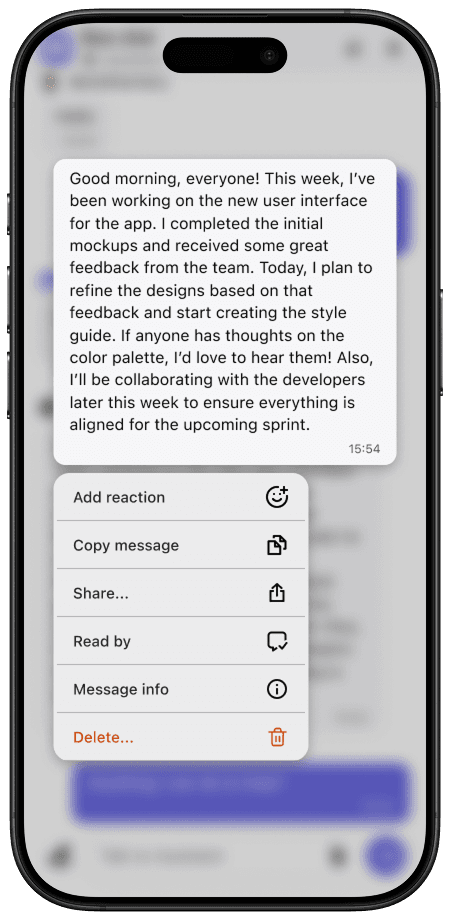
Reactions were one of the earliest collaboration features we introduced for group chats.
The challenge wasn't inventing reactions themselves — it was balancing:
- Usability
- Engineering scope
- Cross-platform consistency
A key product decision was limiting reactions to 6 predefined options rather than supporting the full emoji selector. This significantly reduced implementation complexity — roughly 5 engineering days vs ~2 weeks of work.
There were also platform-specific constraints. SwiftUI limitations on iOS made it difficult to replicate the horizontal reaction tray used on web and Android without substantially increasing scope. I worked closely with iOS engineers to find an implementation that still felt polished while remaining lightweight to build.
Reactions
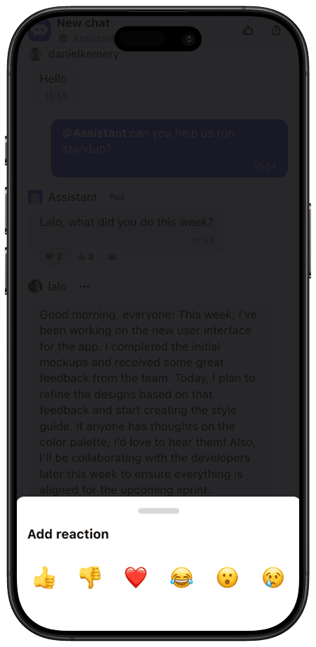
Emoji selector
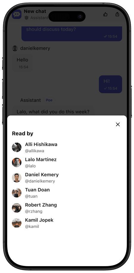
Read Receipts
Extending familiar messaging paradigms into AI chat
Read receipts became especially important once conversations involved multiple people and bots. The primary design question was: how visually prominent should read states be in a multi-user AI conversation?
I explored several directions, including:
- Messenger-style avatar receipts
- More explicit participant indicators
- Lightweight status indicators
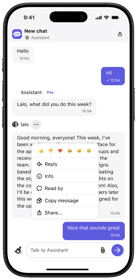
Overflow menu
Receipt detail
We ultimately landed on a subtle checkmark system:
- Single checkmark → delivered / partially seen
- Double checkmark → seen by all humans in the chat
What made this system particularly elegant was how naturally it extended into single-user chat. Because only one human participant exists in those chats, the same logic automatically maps to delivered/read states — without requiring separate interaction models between chat types.
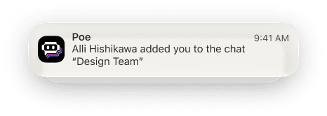
Notifications & Badging
Designing behavioral systems, not just visual indicators
As group chats launched, notifications became critical to making the platform feel alive and active. This work included:
- Unread badges
- Push notification logic
- Notification prompting systems
The complexity here wasn't visual — it was behavioral. I conducted extensive competitive analysis across messaging and social platforms to understand:
- Unread count logic
- Notification frequency patterns
- Re-engagement strategies
- Push permission timing
I then translated those findings into product definitions and implementation guidance for engineering.
Browser badges
Push notifications
In product badges
Browser badges
Push notifications
In product badges

Message Search
Balancing speed, clarity, and infrastructure constraints
Message search was a highly requested feature focused on improving navigation through long conversations. While the UI itself was relatively straightforward, the project required close collaboration with engineering around:
- Search performance
- Result rendering speed
- Infrastructure limitations
Several tradeoffs emerged during implementation. I removed pinned/muted indicators from results to reduce rendering complexity. I also repurposed bold text treatment: in normal chat lists, bold signaled unread messages — in search, bold instead highlighted query matches.
These decisions prioritized speed and scanability over maintaining exact visual consistency.