Overview
Before joining Poe, I spent three years across enterprise SaaS and B2B productivity tools — each company at a different stage and with very different design cultures.
At Coda, I was embedded in a mature design team working on formula documentation and community. At Echo AI, I was the sole designer, responsible for end-to-end product direction. At Five9, I focused on AI-driven customer support tooling within a large enterprise product.
These experiences shaped how I think about scope, stakeholder alignment, and designing within constraints.
2022–2024
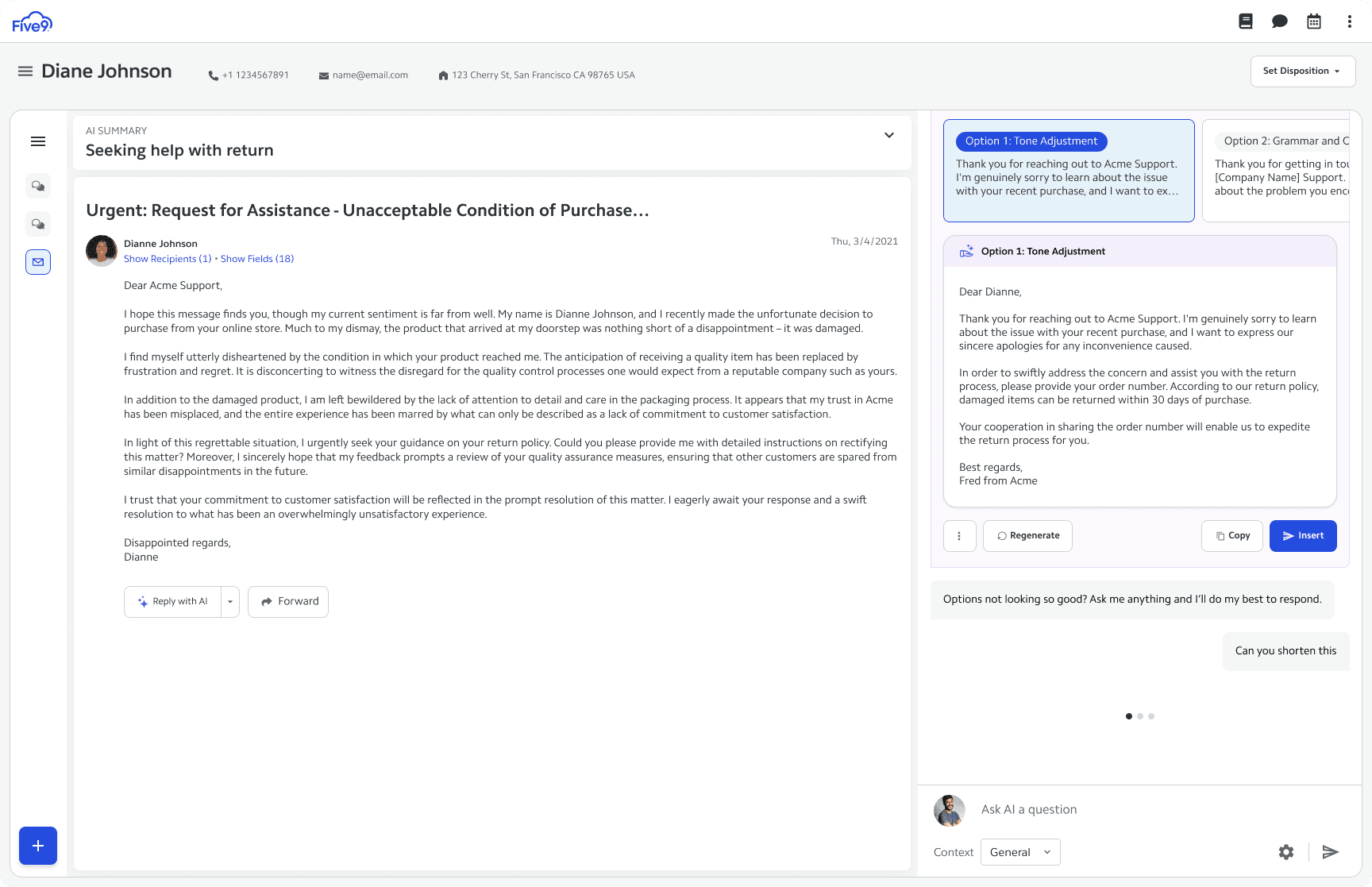
Five9
Five9 is an enterprise cloud contact center platform. My work focused on designing AI-driven customer support tools and modernizing complex legacy workflows for agents and supervisors.
Enterprise design at this scale meant navigating deep institutional constraints — legacy systems, strict accessibility requirements, and a wide range of user technical literacy. The challenge was introducing AI-native patterns into an environment built for reliability over delight.
2021–2022
Echo AI
Attendance tracking from zero
Echo AI was a Series B conversation intelligence and workforce management startup. As the only designer, I owned end-to-end product direction — from research through to shipped UI.
The core challenge: how do you build an accurate, usable attendance tracking system for customer support agents and their managers, from scratch?
From calendar to table
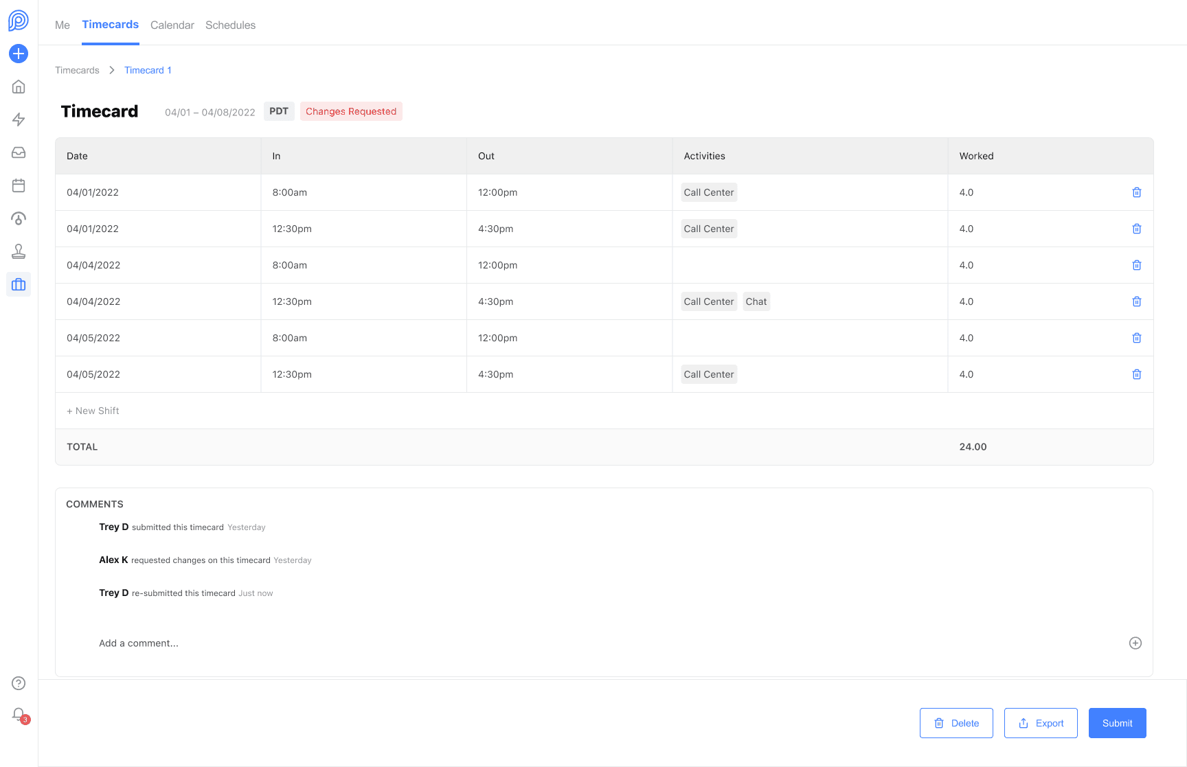
Initial explorations favored a calendar interface — the intuitive choice for time-based data. But after whiteboarding sessions and competitive analysis, we identified two distinct user journeys: time-clock and timecard attendance. We prioritized timecard due to engineering constraints.
The final MVP used a table view — not the most novel solution, but the right one. It reduced engineering complexity, aligned with existing Excel-based workflows customers already used, and shipped on time.
Scoping to ship
I cut export functionality and view-switching from the original scope to hit the launch deadline. Without a dedicated design team, I also worked closely with engineering to build a shared component library — ensuring visual consistency between Figma and production.
2021
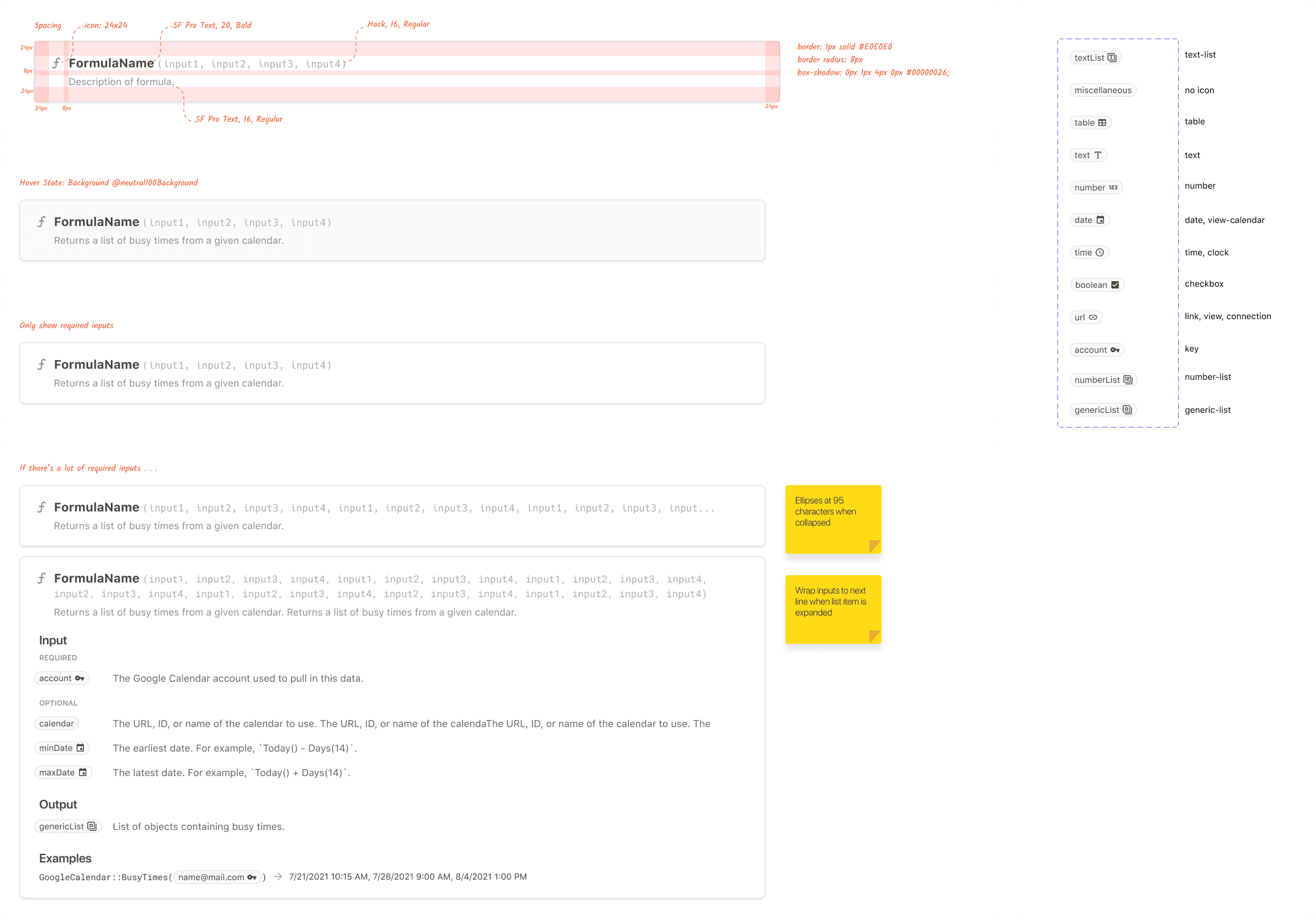
Coda — Pack Formula Documentation
Scaling formula discovery as the Packs ecosystem grows
Coda is a doc platform that brings words, data, and teams together. It offers hundreds of formulas and Packs — plugins connecting docs to external apps. My focus was making pack formula documentation easy to discover, use, and learn.
The problem was scale: as the Packs ecosystem grew with third-party developers, documentation needed to scale with it without becoming unwieldy.
Rethinking where docs live
Early explorations focused narrowly on a standalone /formulas page — adding two-column layouts, icons, breadcrumbs, and color treatments. These iterated well visually but didn't solve the underlying scalability problem.
The breakthrough came from stepping back: instead of building a better documentation page, we moved pack formula docs directly into the Gallery's Packs Listing pages — where users were already discovering packs.
Listing page
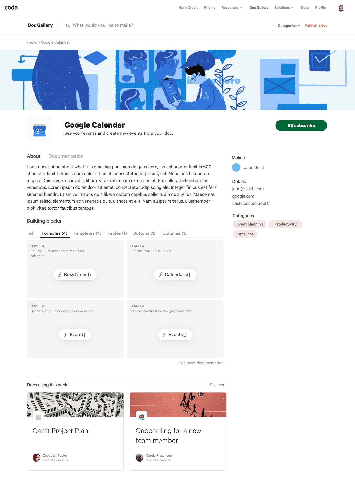
Documentation tab
Desktop

Mobile
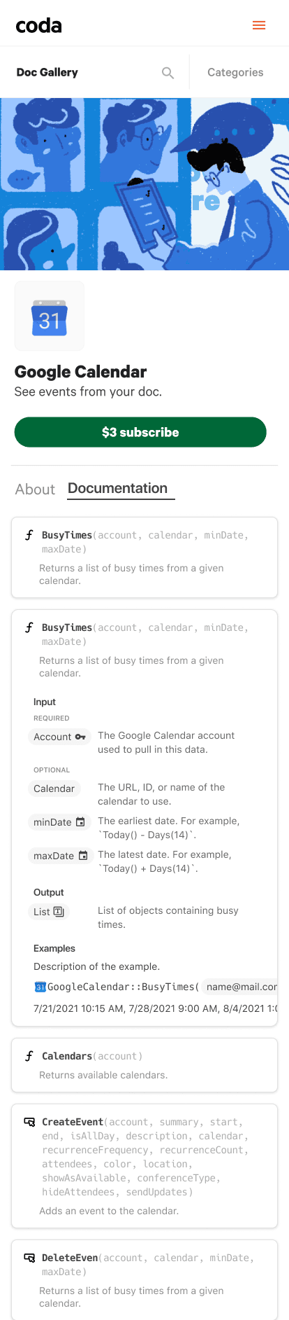
Component breakdown
2021
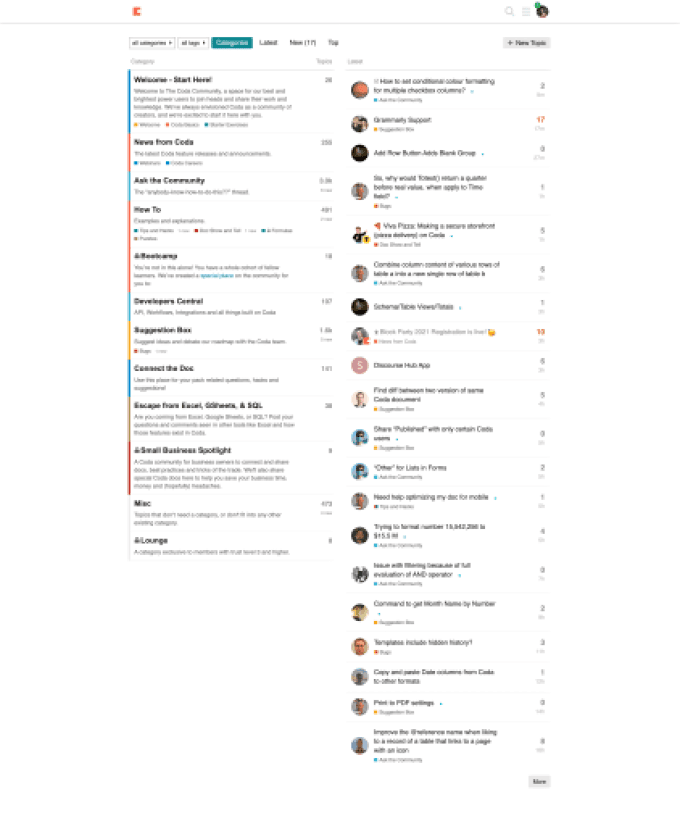
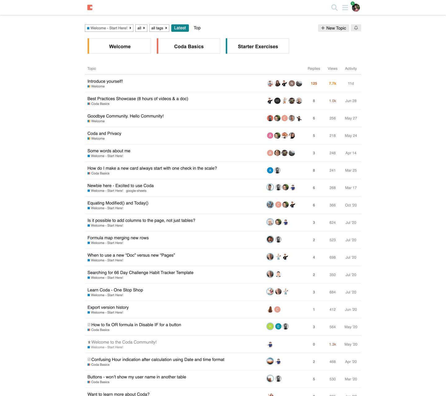
Coda — Community Redesign
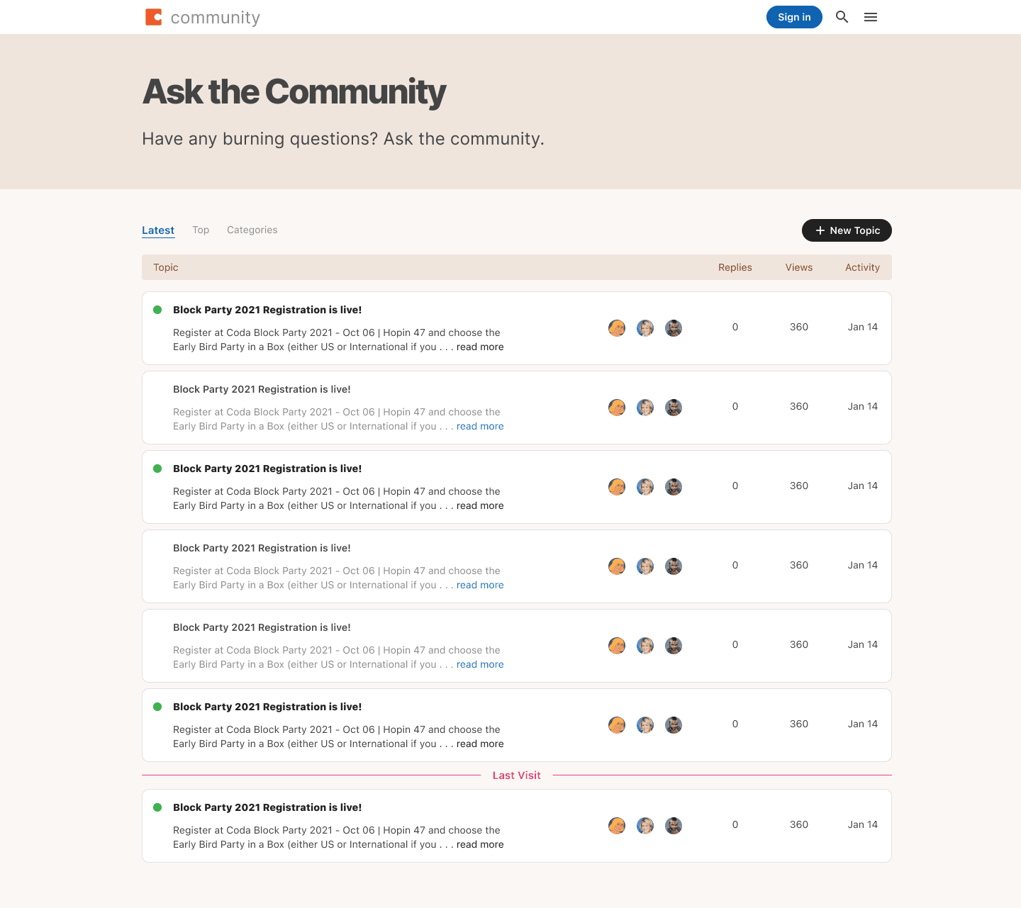
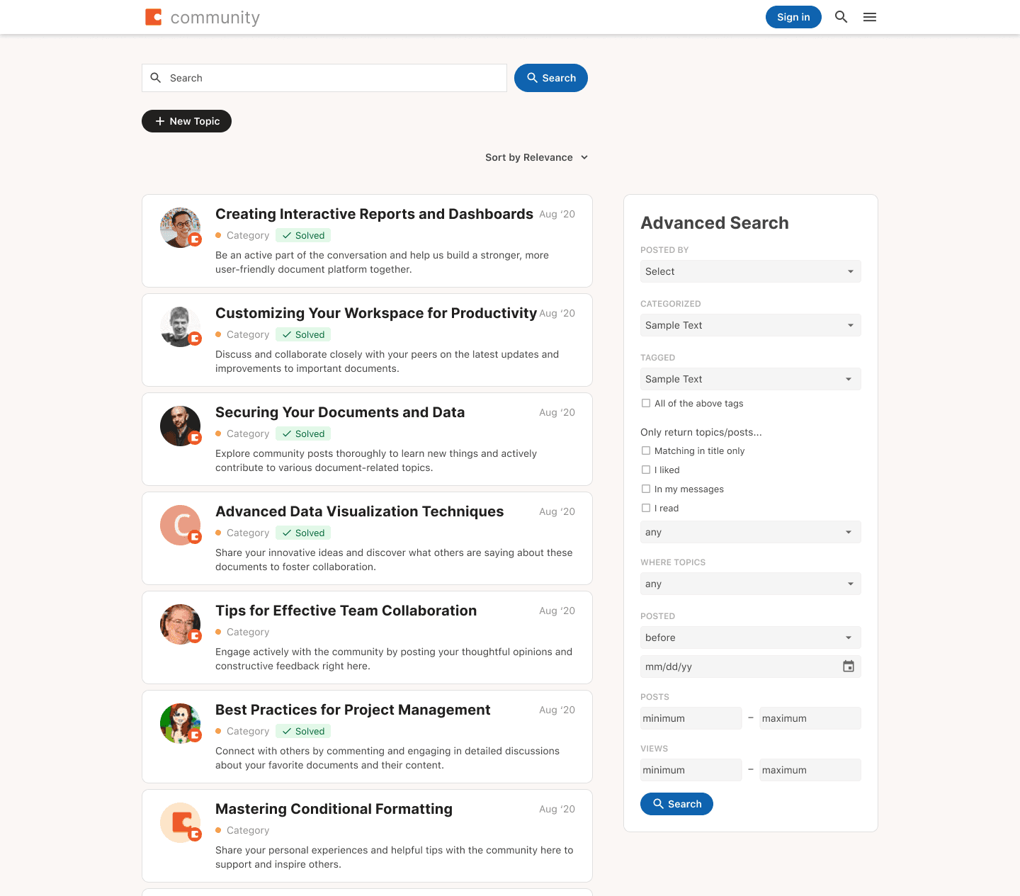
Making community.coda.io feel distinctly Codan
Coda's community platform — built on Discourse — hadn't been redesigned since launch. It felt unwelcoming to new users and wasn't reflecting the brand or the care Coda put into its core product.
The platform was predominantly used by experienced makers rather than newcomers, and the design wasn't helping bridge that gap. The goal: create a more vibrant community that felt distinctly Codan.
What shipped
- Homepage — updated brand colors and illustrations to anchor search as the primary action
- Categories page — product icons added for easier browsing
- Post, search results, and about pages — redesigned for clarity and visual coherence
Homepage
Before
After
Ask page
Before
After
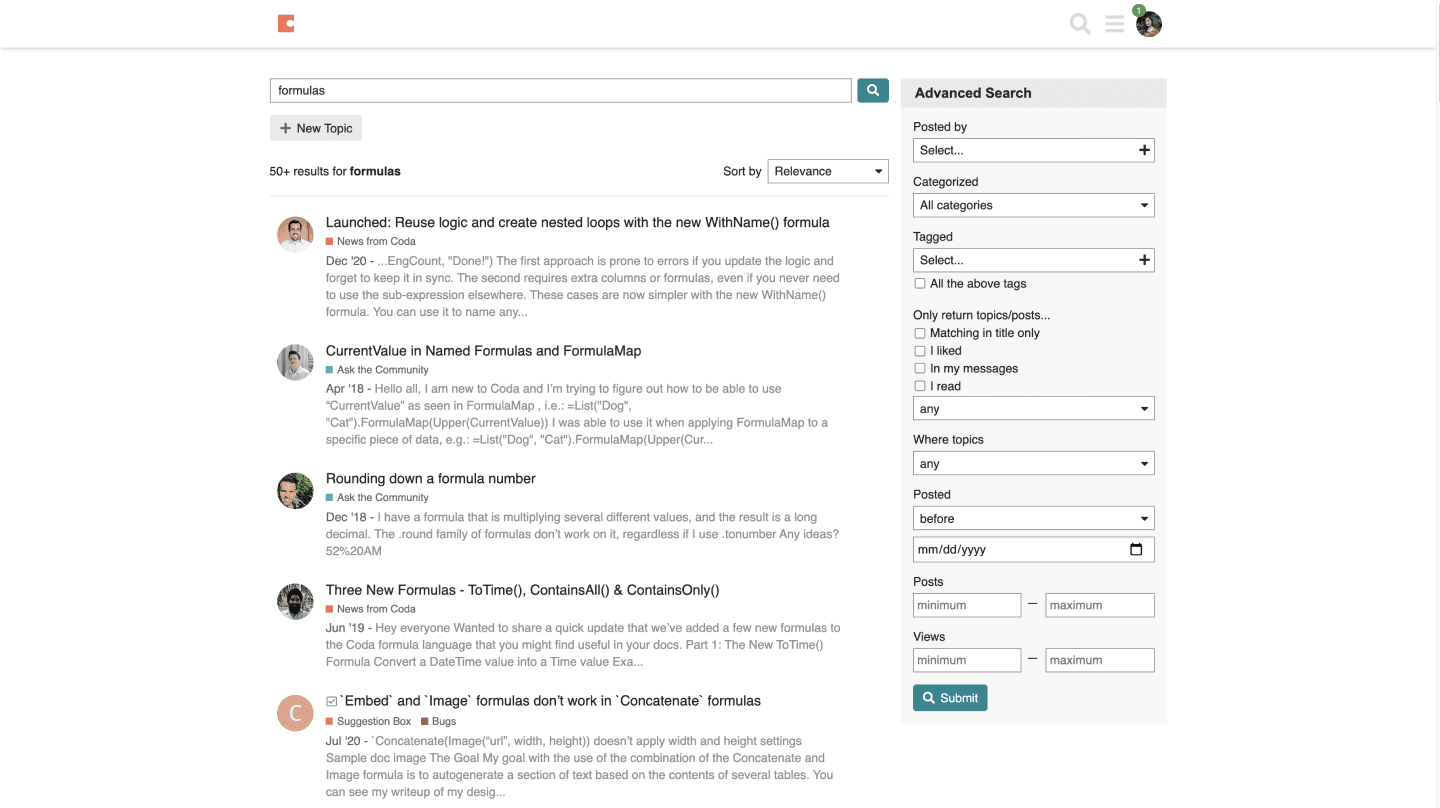
Search results
Before
After
The redesign launched in December 2021 and received positive community feedback celebrating the refreshed identity. Key learning: sharing work asynchronously for feedback — rather than waiting for scheduled critiques — made a big difference in a two-week sprint.